We are getting your scrapping New Year off to a flying start!!!
This month we are teaming up with Finnabair and her amazing DT from
Mixed Media Place.
One of the things that we are very conscious of here at Scrap365 HQ is that
if you are new to scrapping it can be really overwhelming with the choice of
products to use and the host of styles to emulate….the same could be said if
you’re experienced!!
So we have decided that 2014 is the year to get BACK to BASICS!! It
doesn’t matter if you have been scrapping for ten years or ten days...you will
be sure to learn something new along the way!
Finn has very kindly donated a marvellous prize to either add to your
stash or to get you started.
All you need to do to be in with a shot of the prize is follow Scrap365
and Mixed Media Place blogs. Like us both on Facebook and leave a message here
telling us which layout principle you are going to try! We would love to see
your take on the Principles so be sure to upload them to our Facebook page :)
Our January Blog Hop is all about layout principles. I found this
fabulous prompt on Pinterest, courtesy of SuzyQ Scraps http://suzyqscraps.com/. It really sums up
the beginnings of every layout.
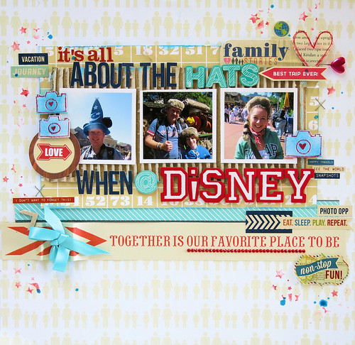
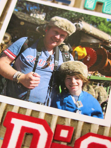
I chose to go with the Alignment. Choosing a photo and printing it off 2 further times.
I've also made one with the 3 photos, but using different photos.
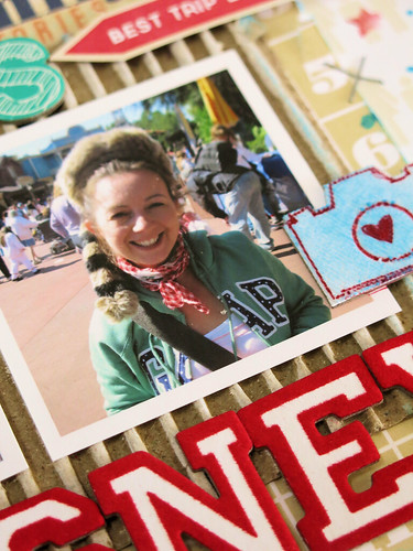
I'm going to be totally honest here and say, I have actually added this LO since posting this blog hop post this morning. I had this second LO ready, but I just wasn't happy with it. I didn't feel happy with adding it to my post. It's been sat on my desk for some time now (it was actually started before Christmas) but I just couldn't move forward with it and it just didn't look finished.
So this morning I've taken some time and I decided that I wouldn't let this LO get the better of me.
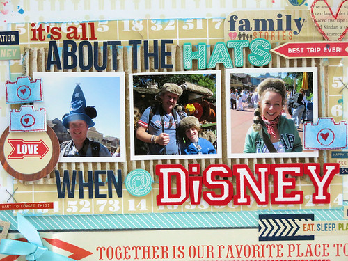
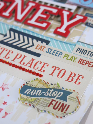
I removed the original title which was just 'Hats' where 'Disney' now is and added an Extra long title.
I like a good amount of balance on my pages and I needed to balance out my title by using the same colours top and bottom. I stuck to a colour combo of red, aqua and navy.
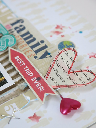
I also used a Simple Stories sticker sheet - Urban Traveler and added the stickers around the edges.
I now feel so much happier with this LO and it finally feels finished.
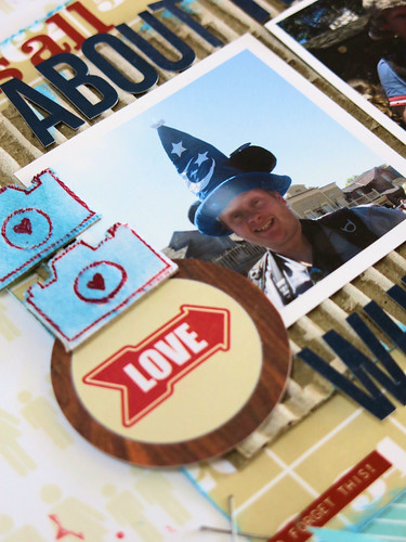
My sweet friend Alexa gave me some goodies when she visited me recently. The fabric Studio Calico cameras were amongst the goodies. I inked them in blue and added some red pen to them.
These stickers really did the trick and saved this LO.
So there you have it, the story of the saved LO.
Am I the only one that has moments like these???
Don't forget to leave your comments on the Scrap365 Blog when you get
back to the beginning and follow the instructions to be in for a chance
to win that gorgeous prize! And maybe you could leave some blog love on
the DT blogs along the way.
Here is the full blog list.
Thanks so much for playing along with us.
Have funxxx
Please visit Helen next.
http://helentilbury.blogspot.co.uk/


23 comments:
Wow!! Super idea is this photo's repetition. I like it very much. Thank you!!
A great version of repetition here. Love it. Jenny x
LOL lovely funny page - what a great thing to capture. Love the colourful nature of the photos and details.
beautiful !!!
What a happy page and the story made me laugh :D M x
Well worth the wait ;) A brilliant example of repetition....love that photo (or photos!!!) Adorable little cluster too! Thank you so much for being part of the Blog Hop, you lovely scrapping fairy, you x
These are gorgeous!! I love love love the colors and the photos!!!!!
thank you so much for the inspirationo, I love the second page!
Love both pages Lisa, fabulous details......thanks for sharing.
Your layouts are great! I like the concept of alignment it allows for more photos and has a clean look to it. I think I will be trying all of these techniques out at least once! Thanks for sharing!http://mybeaner.blogspot.ca/
It's so cool to see the Principles in action - love the aligned version here - and amazing repetition too in the first one. Love those bold bright colours to accompany the Disney pictures - fantastic. Thanks for the inspiration.
Alison x
Fantastic layouts, I love the super images and colours too!
They both look stunnig!! Im glad you didn't give up :) Thanks for sharing!
Fabulous layouts, great examples of repetition. Love the texture & colours of the 2nd one :)
Love the use of repetition. Great layout (I hate bees and wasps too).
I can see why it is one of your faves and mine!!! If at first....!!! Another gorgeous example x
Loving your layouts Lisa....Loving the colors on both!.... Hugs...x
Both layouts are so fun and inspirational! I live in Tampa so we are Disney regulars, love that layout!
Well done for rescuing that second layout - it happens to me all the time! Fab layouts both but I do prefer the second one ... stickers are now so cool!
I love your layouts.. that was so cute of your son protecting himself.
So glad you conquered it.
I love your layouts.. that was so cute of your son protecting himself.
So glad you conquered it.
Really wonderful pages!
I LOVE the Disney layout - I'm so glad you didn't give up on it! I have so many layouts that I haven't finished from a year ago - you have inspired me to salvage them!
Post a Comment